How to Create A Captivating Wedding Website
Out with the invitation, in with the wedding website!
More couples (79% in 2019 to be exact) are ditching the tradition of including all wedding information in their invitations and opting to direct guests to their wedding website instead. It’s the easiest way to get all of your wedding details to your entire guest list without having to contact each one personally, and also allows for flexibility as your plans get updated. From location details to links to your wedding registry, we’ve got the secrets to keeping your wedding website fun and informative! Look below for our five tips on how to create a captivating wedding website.
Make It User Friendly
The main reason for a wedding website is to streamline the process for your guests, so keep the site simple and easy to navigate – you don’t want them sending you texts or calling for directions on how to move around your website! Make sure you have a navigation bar, readable font, correct letter sizing, and clear mobile viewing. Have a friend look through your website with a fresh set of eyes before you publish the website and make it live to all guests to make sure all information is clear. Pro tip: Don’t recreate the wheel, utilize the many templates that are already offered via free sites like Zola, WeddingWire, The Knot, and Minted!
via Unsplash
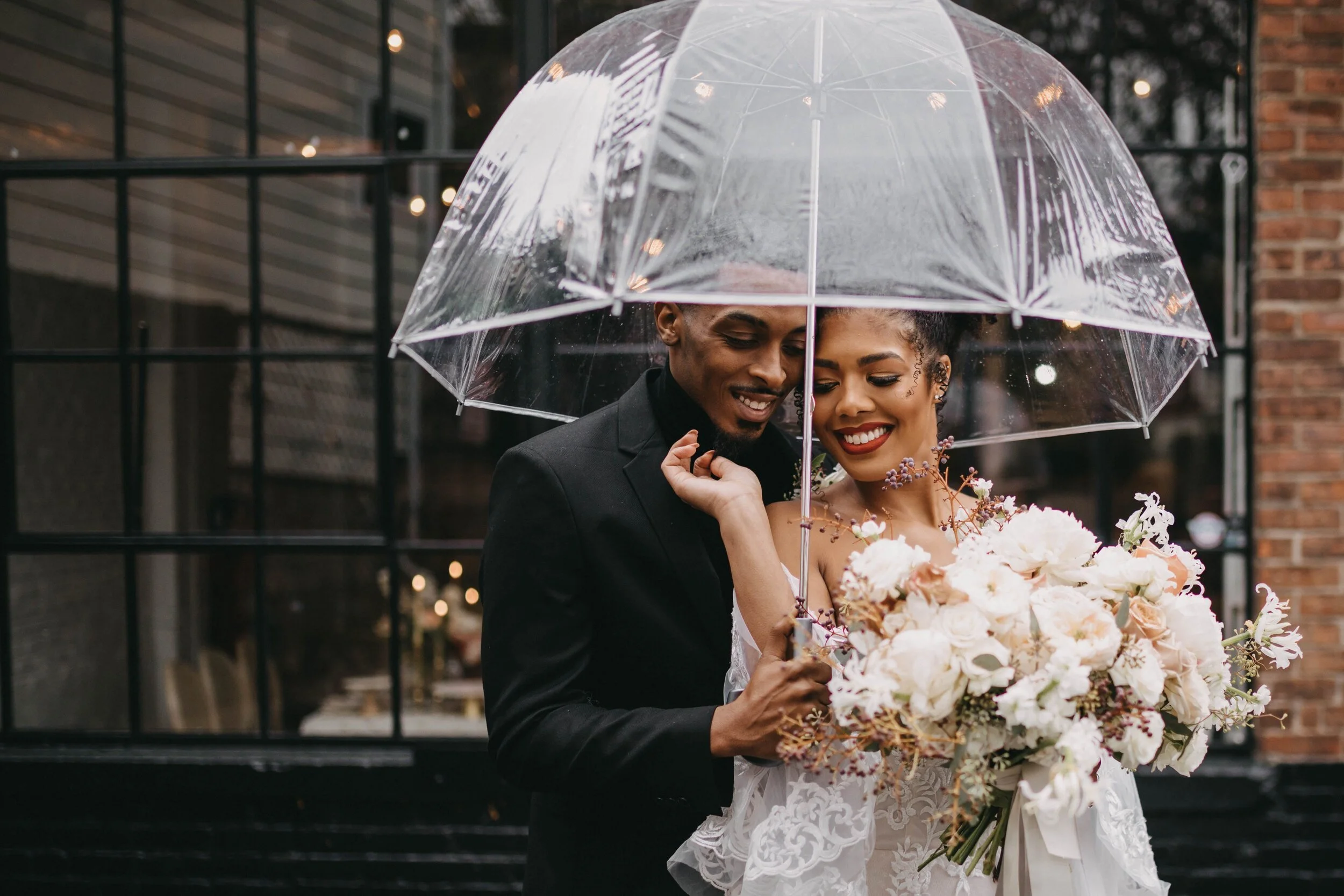
Photography by In Our Image Photos
Tell Your Story
Whether it is getting a bit personal and sharing your love story or incorporating your wedding theme in your website design choices, your wedding website is a representation of who you are as a couple and can set the tone for your big day! Help your guests get to know you better as a couple by sharing photographs and little tidbits (hello engagement story!) about your relationship. Keeping to your wedding theme and curating a website design that plays to it will also give your guests an idea of what to expect in terms of dressiness, color palettes (we’ve heard many cringe stories of guests showing up in bridesmaid colors), and general vibes to expect!
Don’t Write A Novel
Keep it short and sweet just like you would on an invitation. With a wedding website, you might have more space to write long paragraphs and include every possible piece of info, but it’s better to stick to the basics - date and time, location details, travel directions, dress codes, and registry links. You can include a brief greeting to your guests and a small look into your story as we mentioned, but don’t forget that your wedding website is a practical resource for your guests to refer back to and shouldn’t leave your guests with any confusion.
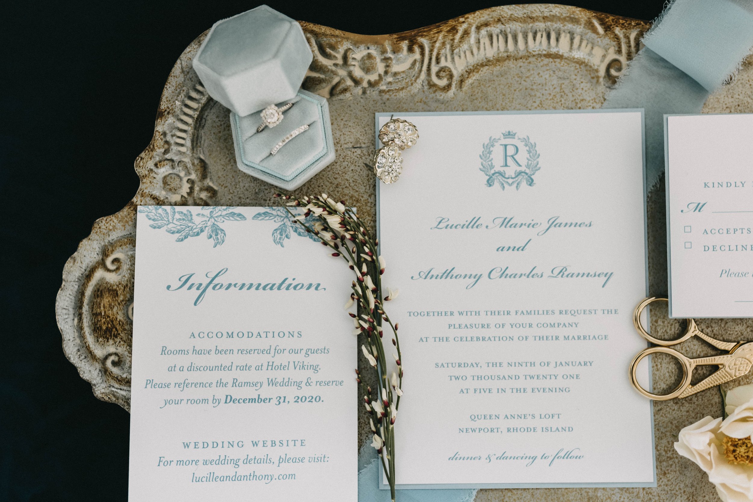
Photography by In Our Image Photos
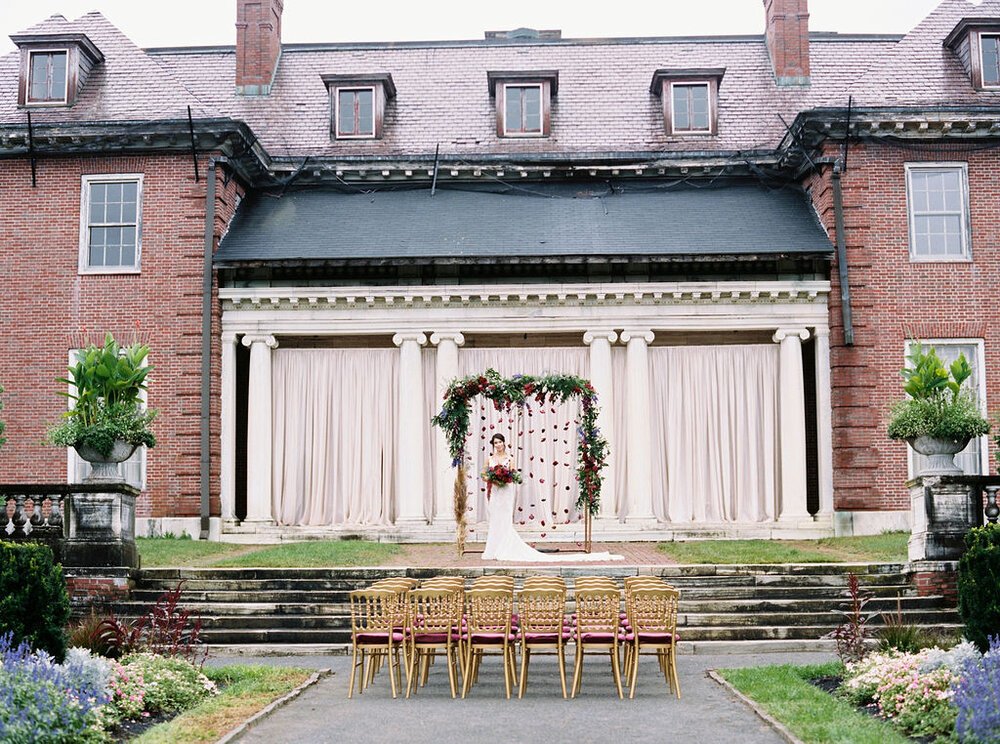
Photography by Courtney Chau Photography
Have Fun!
Creating a captivating wedding website does take some work, but it’s also supposed to be fun! Start working on it early on in your wedding planning process with your partner and create something that you both love. You can create a mock-up version that you continue to edit until you come up with a website design that fits your wedding theme and your personality. Don’t be afraid to be creative with your wording either, whether that’s incorporating jokes or wedding lingo, a website that makes your guests smile or laugh is what will make it stand out. Once your website is up, the countdown to your wedding is officially on!
Share this with a bride who just got engaged and needs some wedding website guidance. Have fun putting your web design together! Starting the process of searching for your wedding gown? Browse our collection of made-to-measure wedding gowns that are all priced at $1,200 or less!
Other Topics You May Be Interested In
